-
I was asked by the lovely people at Agile Films to come up with an interesting way to showcase their client's new trend forecasting software, Ascendr.
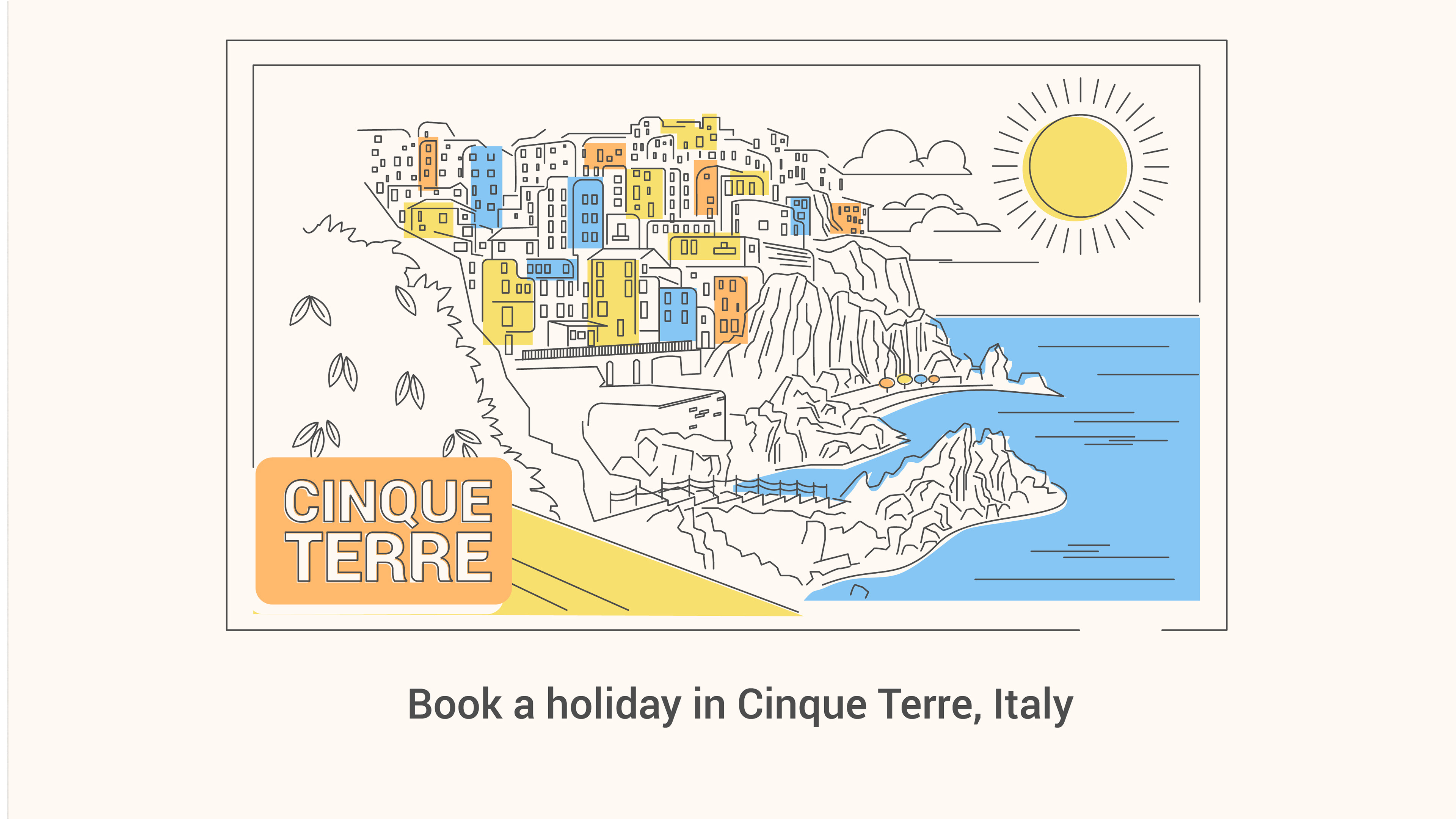
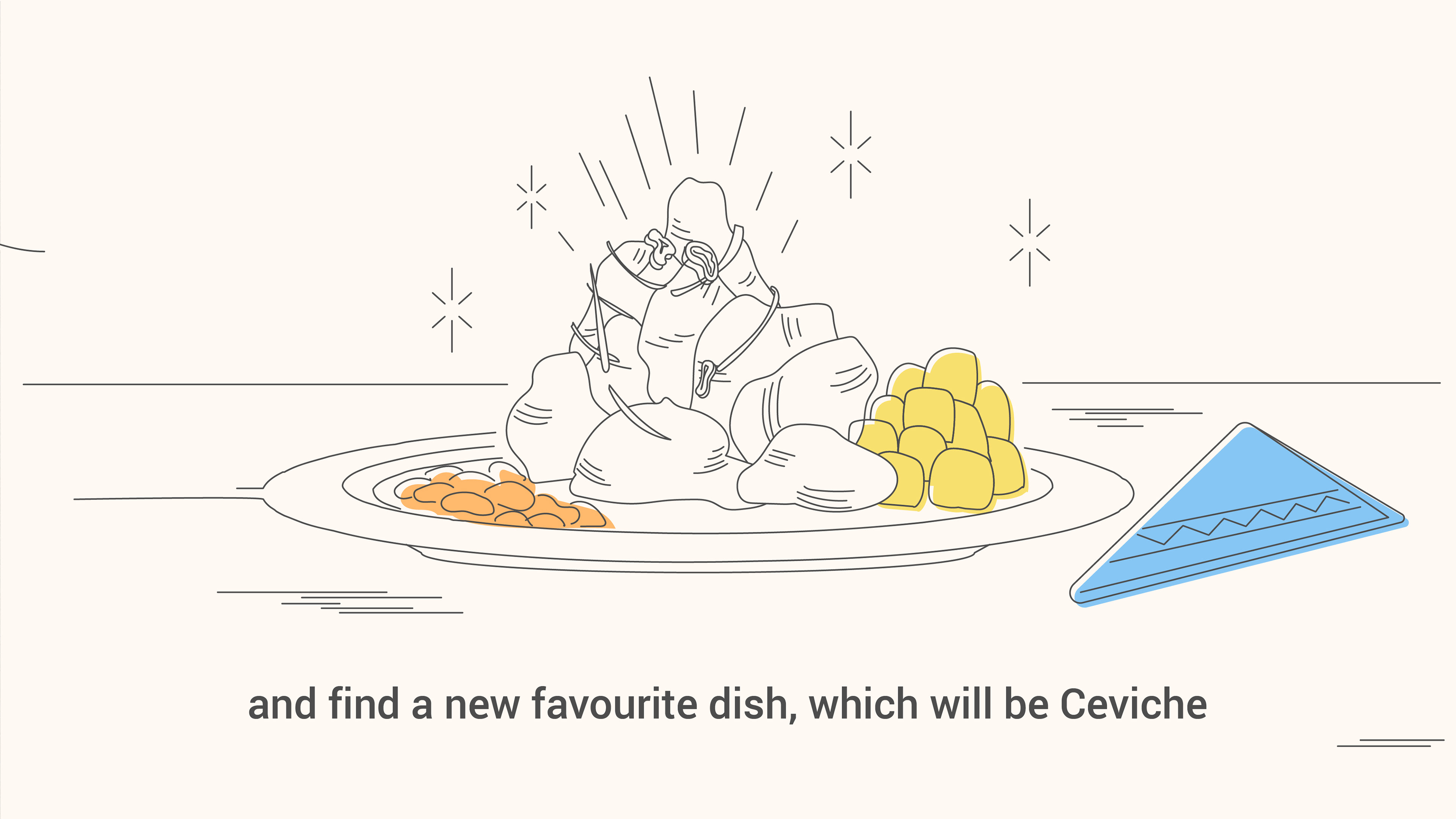
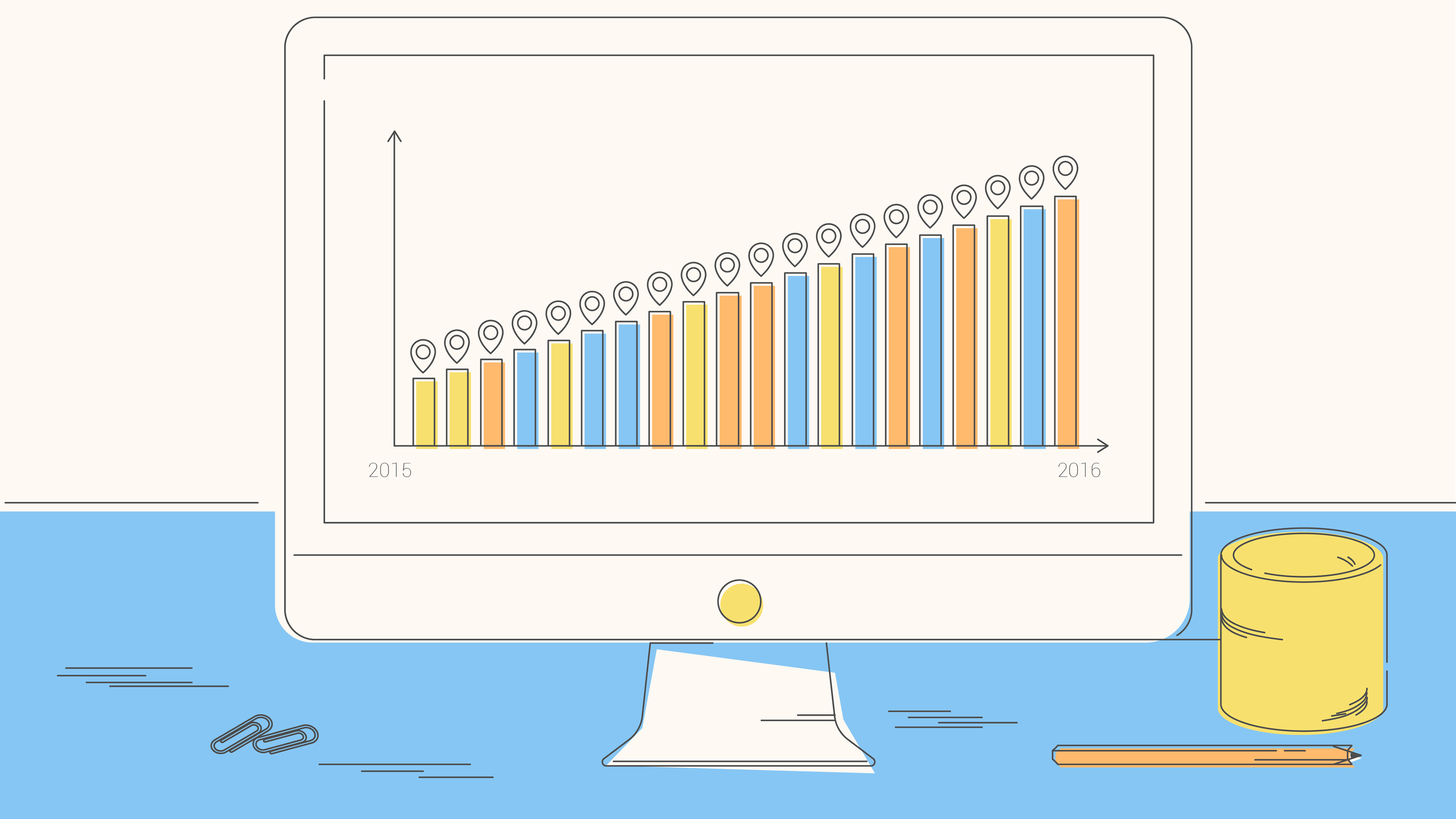
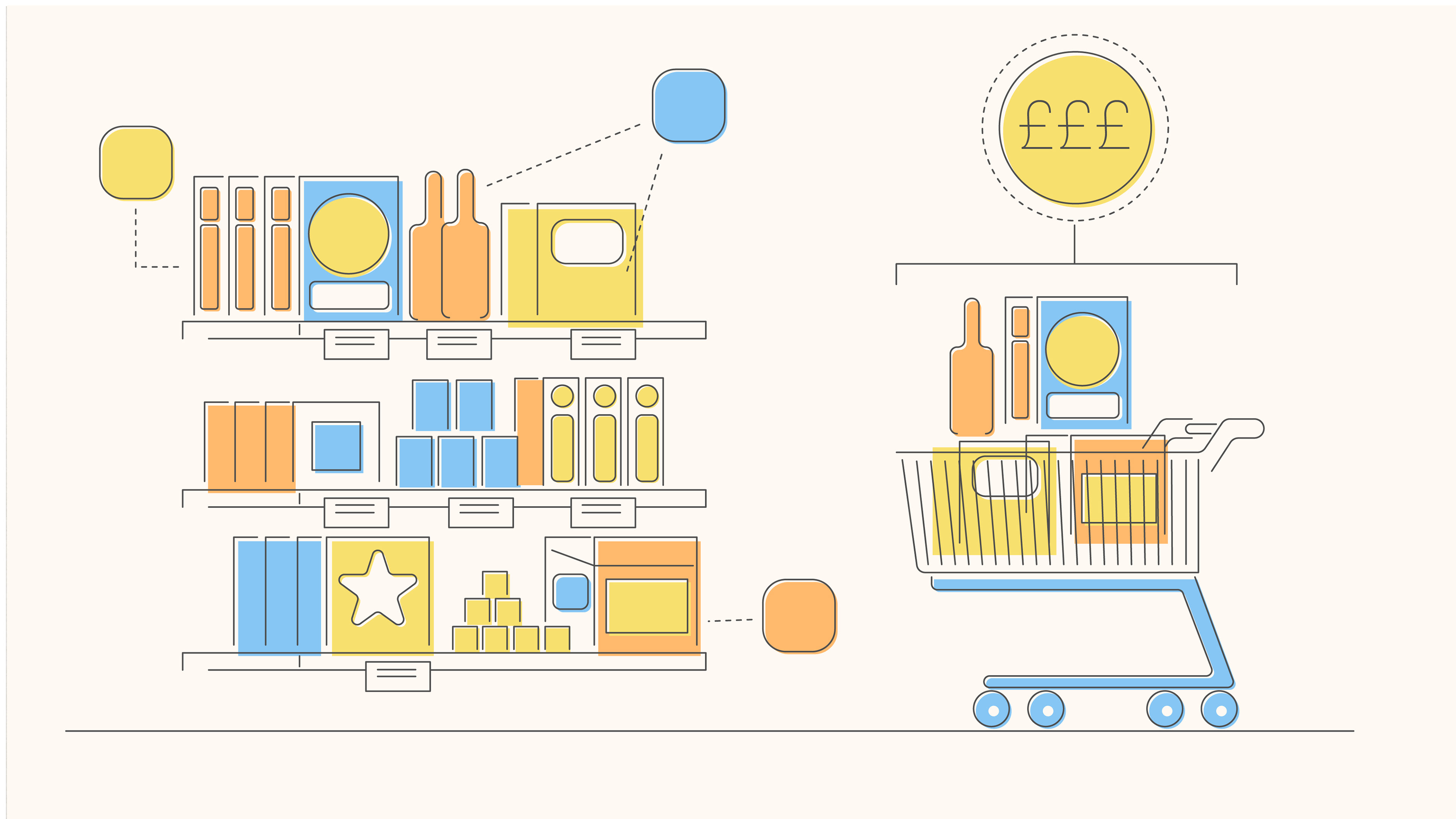
I liked the idea of using lines to make connections that build images. I felt this would make a nice metaphor for the software's method of connecting different information sources to build a picture of future trends.
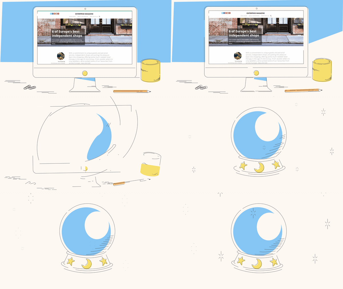
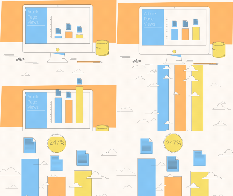
After some testing, I found that overlaying these sequences during transitions would reinforce the idea of linking disparate information while adding visual interest, providing smoother, more satisfying transitions.
After some testing, I found that overlaying these sequences during transitions would reinforce the idea of linking disparate information while adding visual interest, providing smoother, more satisfying transitions.
-

-
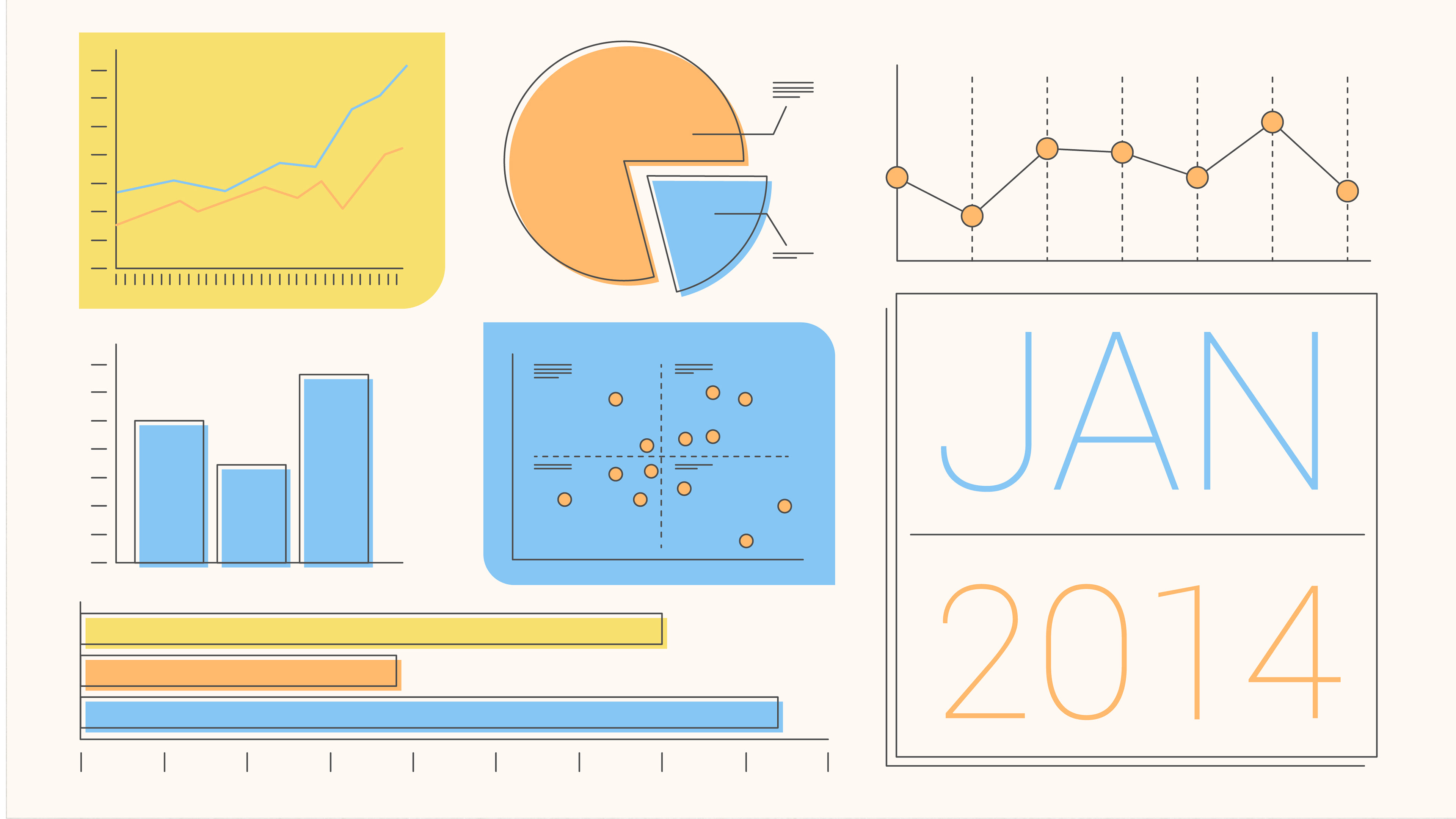
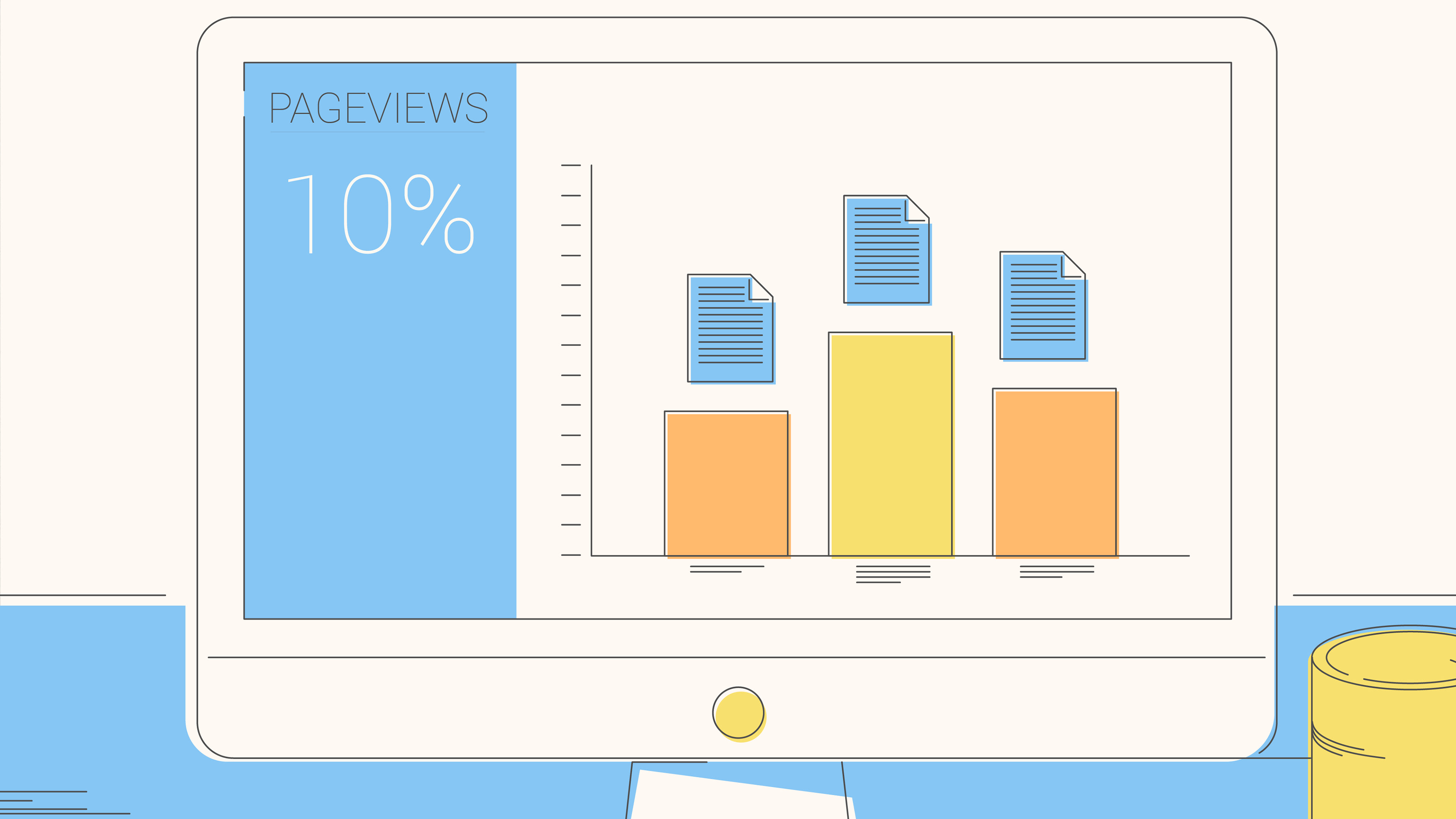
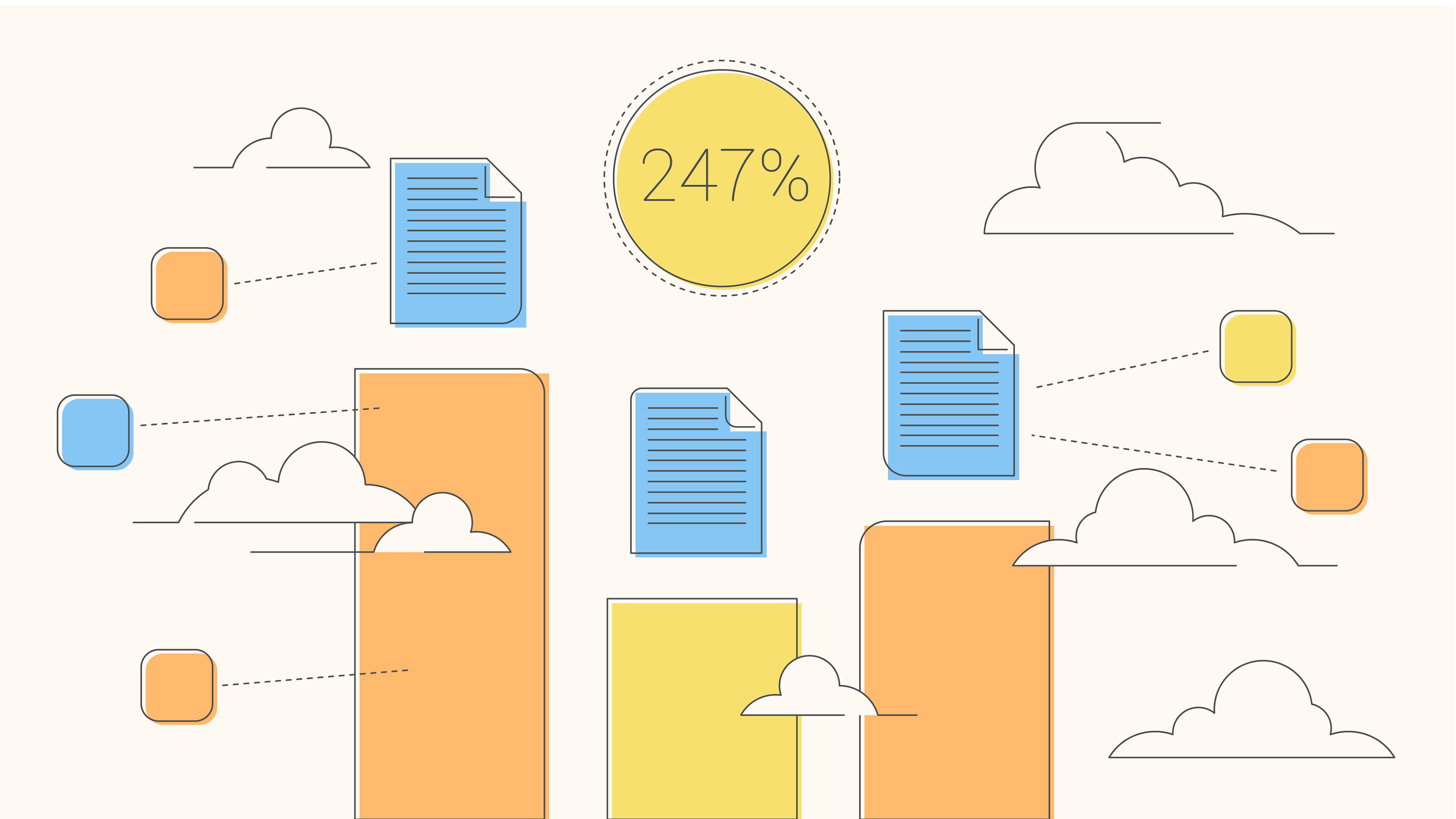
For the colour I went with a narrow, pastel palette. I was aware that the software used google maps as part of it's UI, and I wanted the colours to complement the website as much as possible without mimicking. I used an off white background and grey outlines to soften the feel of illustration and make it a little more friendly.
-
- Storyboard Frames -
